This is some audience feedback I've been getting on Facebook about my print products so far.
I've had really positive feedback on my front cover. Everybody seems to of liked it and I've had no criticism. So this shall be my final piece.
For my adverts, different people have liked the two different adverts. Some prefer the bigger one with more text on it.
Some prefer the smaller one with less text. More people have liked the smaller one so I'll be going this one. I'll add on a website too to make it look more generic.
Monday, 2 April 2012
Sunday, 1 April 2012
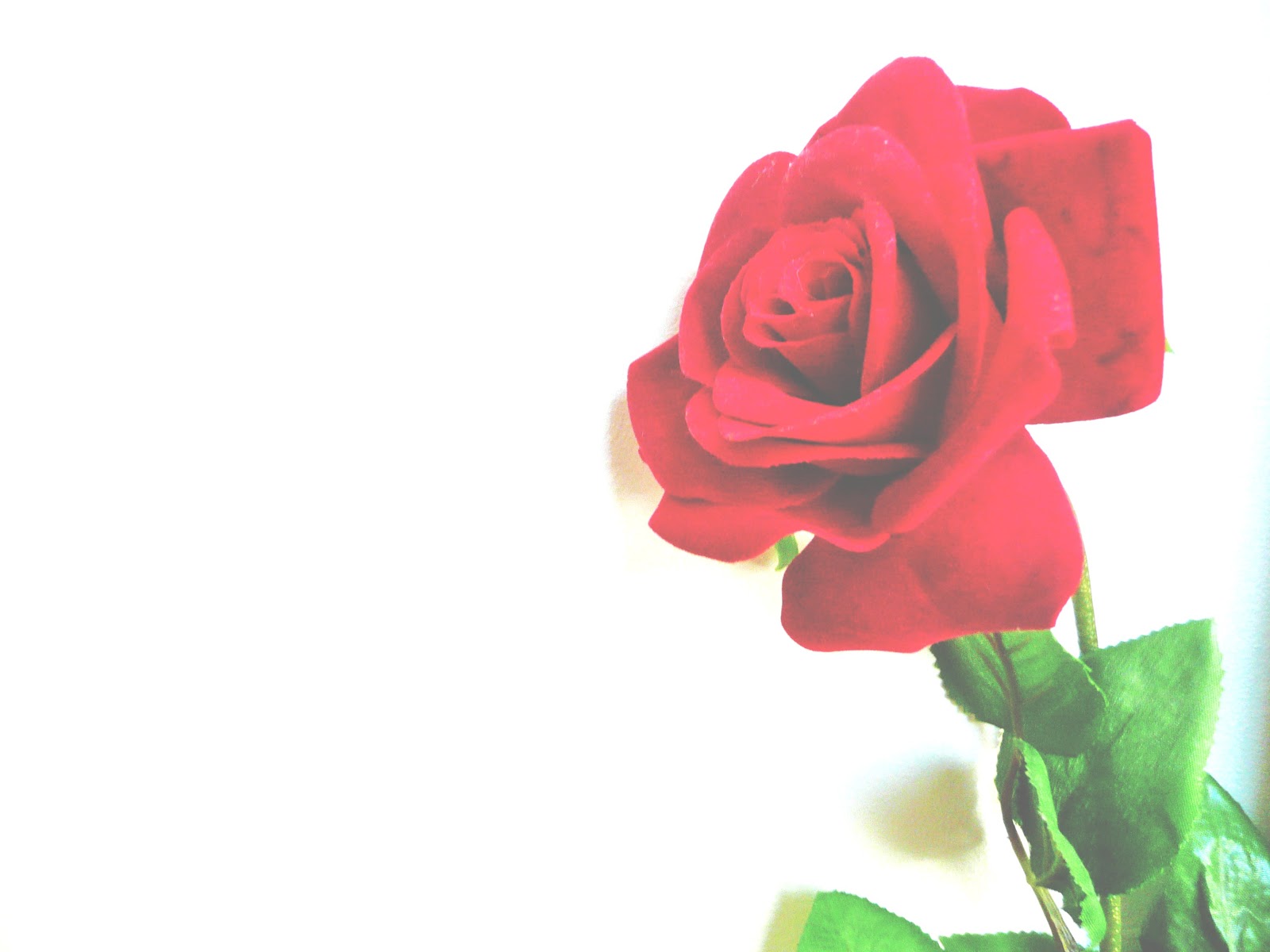
Another possible Digipak picture.
I edited this to a high contrast but thought it was too bright for my Digipak.
So I edited the brightness so that it goes well with my other pictures.
I'll use this for one of my inside pages.
Advert Drafts
Draft One of my advert. This one includes alot more text then the second one. Also a quote from a magazine.
Here's another one I've done. Less text and is a lot smaller.
I've put them both on Facebook for audience feedback.
Edits and Draft 1.
I've edited my cover photo for my digipak to make it look more hazy - I did this for it to appeal to my target audience abit more. I want it to look elegant and simple as I feel it would be more effective.
This is my first draft of the album cover. Its a little messy at the moment and the 'Sally J Johnson' part I copied it instead of manually writing it. So I'm going to do it again.
Feedback - Digipak
I got some audience feedback on one of my digipak pictures and they all said I should use it for my front. They all liked the effect I put on the picture too!
Subscribe to:
Posts (Atom)